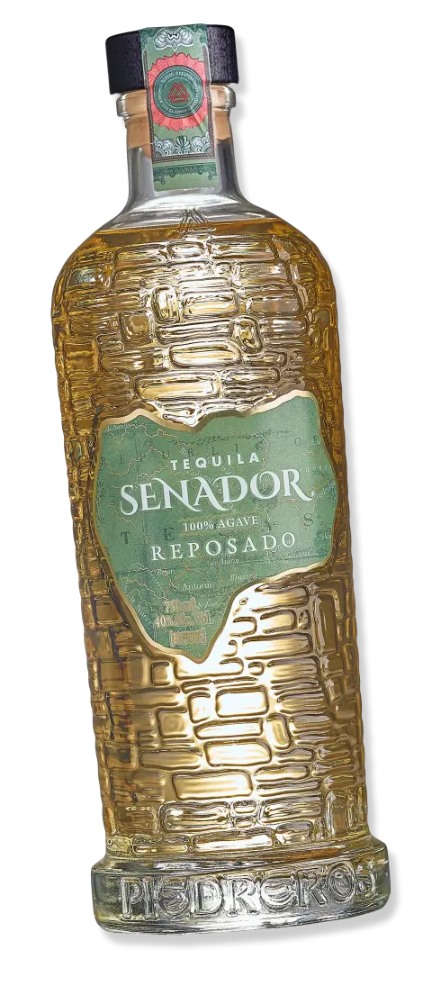
The map isn’t decoration.It’s a connection.
Mexico and Texas have alwaysbeen part of the story.
Every label carries areminder of both.
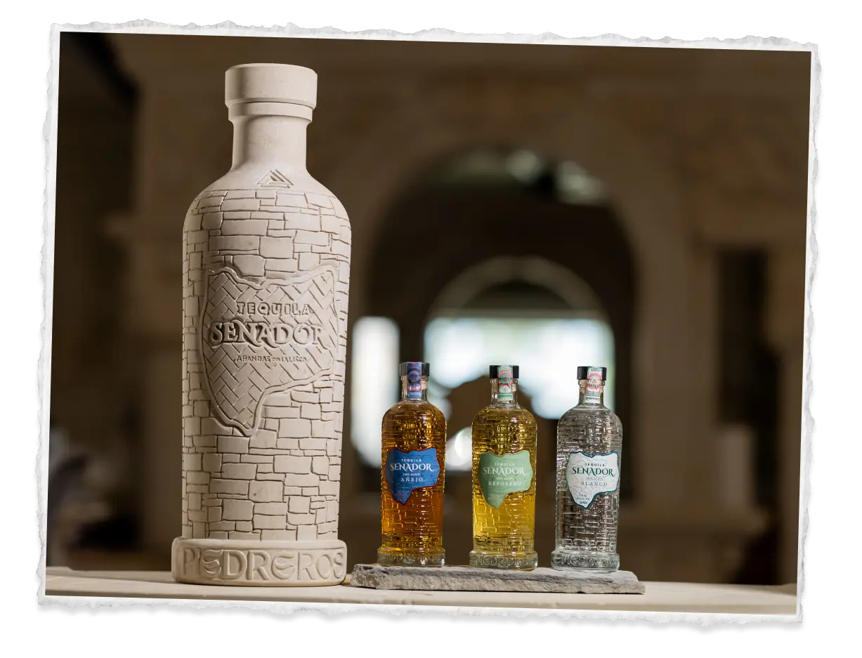
Stone isn’t decoration.It’s structure.
The texture, weight, and form of the bottle reflect the foundation behind the brand.
Nothing extra.Nothing unnecessary.
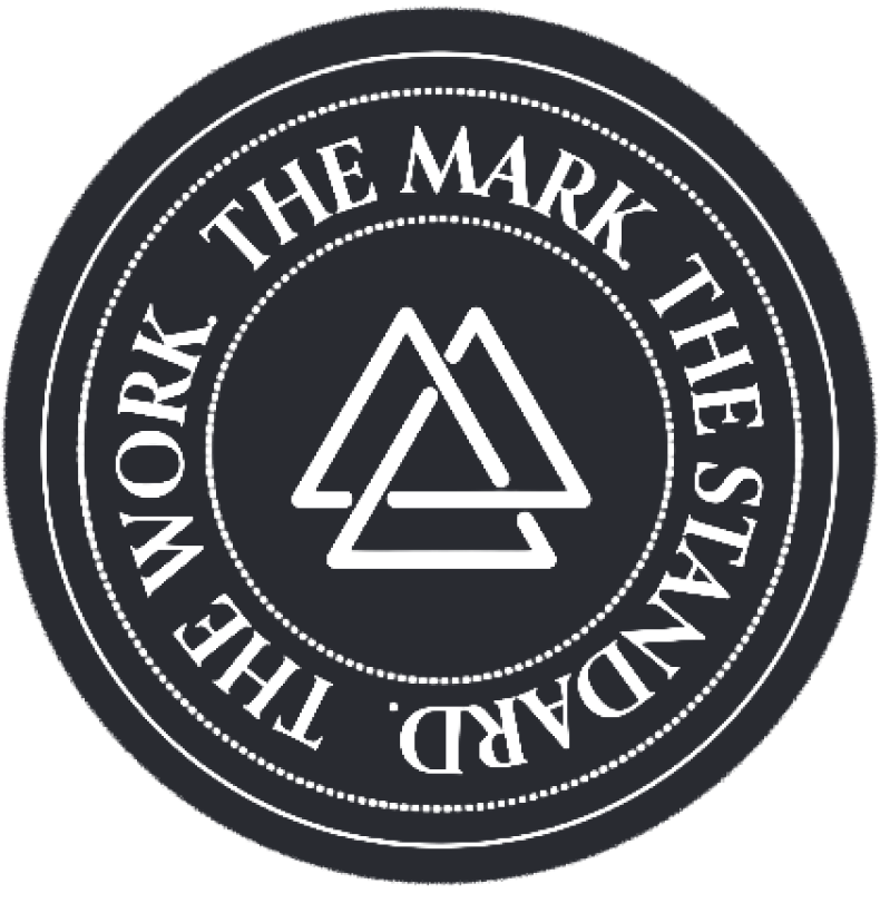
The mark begins at the foundation.
Pressed into the base of every bottle.
It appears again at the neck, carrying the same symbol throughout the design.
Not placed for decoration.
A sign that the work behind it meets the standard.
Stone.
A map.
A mark.
Together, they define the standard.
Store locator coming soon.


 THE WORK